In 1999, I graduated from the Rochester Institute of Technology with a degree in Graphic Design. During my four-year studies on the subject, I completed several assignments by creating aesthetically- and mechanically sound tabletop game components. Even back then, I saw the very direct connection between good information design and accessibility in gameplay. On a deeper level, I seem to have known there was a calling towards game design.
(Funny enough, there seems to have been something in the Genessee River water; I later learned that I preceded my eventual Op Games boss and co-designer Pat Marino by just a year at RIT, and I worked on the school’s Tech Crew side by side with Elan Lee, who’d go on to invent Exploding Kittens.)
I spent just over a decade after that working primarily as a Graphic Designer and Art Director, before sliding into the tabletop games industry full time. To this day, I credit my background in visual design as one of the most useful skills I have for designing games, especially when it comes to prototyping and user testing.
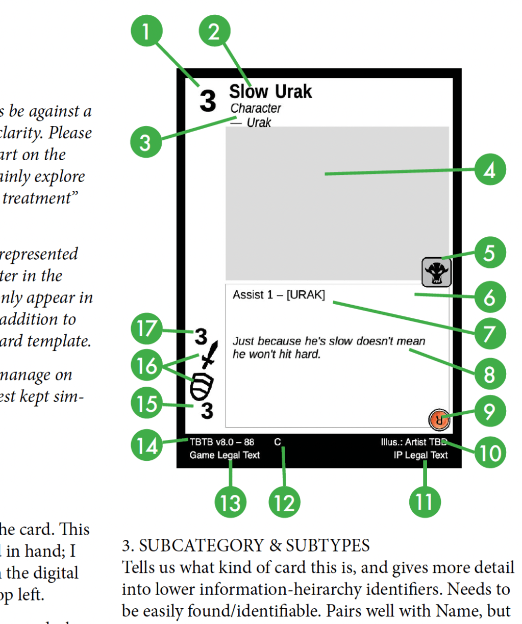
Last week it came full-circle.
I’ve been writing for a few months now about the trading card game I’m co-designing for Ryan Cahill’s The Bound and the Broken fantasy novels. We’re nearly done with our initial set design — around 240 cards — and have started exploring what these cards will actually look like. Ryan’s already been commissioning art for some non-game trading cards; he uses them as perks for subscribing to his Patreon. It wasn’t a huge jump for him to look into using that same art for a TCG.
Here’s a sample of what those art cards look like:
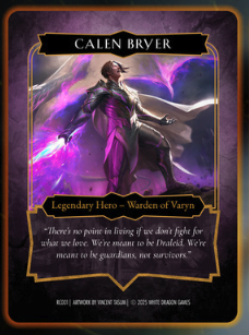
The illustrations are just flat-out gorgeous. Some of the cards have a foil treatment that just takes the whole thing to another level. The frames are exciting and stylish.
They’re just not built to carry the amount and kinds of information a TCG card needs to convey.
This is where I pick up the old Graphic Designer hat and stack it on top of the Game Designer hat I’ve worn for the last 6-odd months of this project. If this were 100% my own project that I was doing everything for myself, I wouldn’t need to build a Card Template Guide, I’d just revert back to Graphic Designer Fletch for a bit and get it done. The cards would speak for themselves. We’ve got a much more skilled graphic designer attached to this project though, so for the most part I’m able to stick to being Game Maker Fletch.
That does mean though that I need to communicate to the very skilled and talented graphic designer what the cards absolutely need in order to make the game work. I’ve been elbows-deep in the crafting of this game for half a year, and nearly everything you’d see in the current prototype is there with some intention and nuance. I can’t expect someone else to pick those visually raw, unpolished game cards up and know immediately where to start the process of making them look amazing. You’ve got to know the rules before you play the game, and you have to know where the information-load-bearing structures are before you start moving things around and glamming them up.
Around the last week of May, I began writing a technical design document to hand off to the graphic designer who designed Ryan’s art cards. It had to cover a lot of ground. How do the cards get used by players? What elements need to go on each card, and what’s their information hierarchy? How many different types of cards are there, and how do they relate or differ? What sorts of iconography will the game need?
My document had to detail everything, and explain how it all intersects, working from an assumption that the graphic designer had never played or seen a TCG before. (It’s a pretty broad and possibly unfounded assumption, but these bases need to be thoroughly covered just in case.) Diagrams and content outlines would abound. It’s probably a good thing that I really appreciate a well-made diagram. Leftovers from a former life, I suppose.
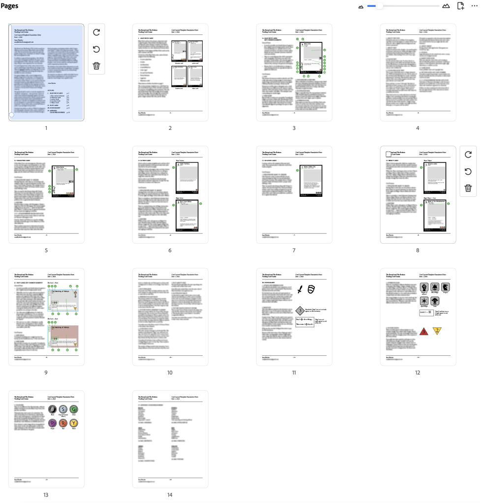
Fourteen pages. It covers five core card types, two card sub-types, treatments for images, recommendations for frame designs, typography, some print production considerations, iconography, and why I couldn’t output my current prototype in a format the graphics team would find useful.
The document starts with one of those outlines I mentioned, pulling double duty as a table of contents. Not the most thrilling tale to tell here, but I stand by its importance. If you ever find yourself writing one of these design guides for your own game, I can’t recommend enough that you start with an outline. You’ll need to revise it multiple times as yo go, for sure, but it’ll help you make sure you don’t miss anything as you start barreling through everything. It’ll also make anyone using your guide a lot happier when they can see right away where they can find the specific answers they’re looking for.

After that, there’s a “broad strokes” page that explains the high-level, basic differences and commonalities between various card types. It shows at a glance where we’re going to be heading in the rest of the guide, and digs into the card elements that will need to appear on nearly every card. Of those, there are roughly seventeen components that are standard on the vast majority of cards a player will put in their deck, and I describe and give recommendations on all of them. When all is said and done, this is probably the most important page (or two) in the document, as it breaks down what can be stylized the most, what needs to be “function-first”, and which elements need to be locked into place or moved around for the coolest visual effect.
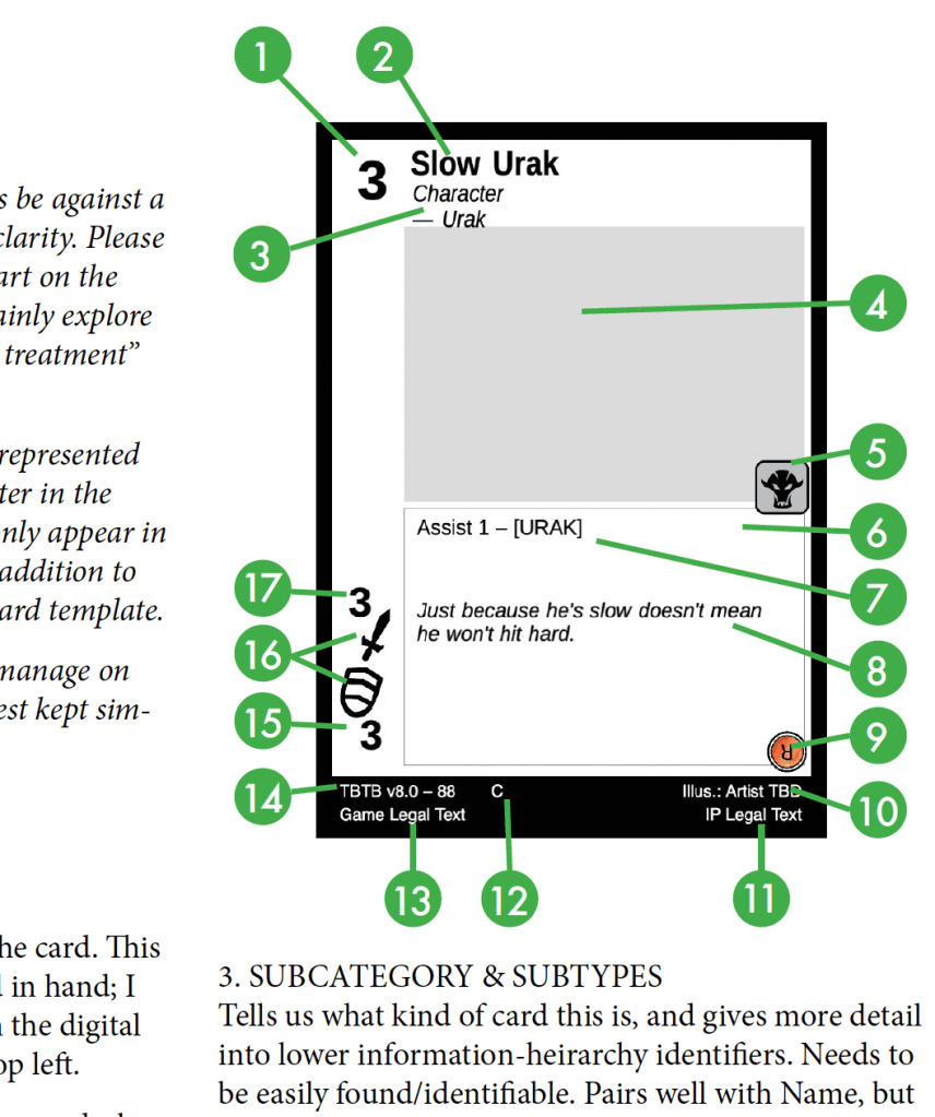
For example, I’m a big believer that a card’s name (item #2 in the diagram above) should be at the top of the card. If I have more than one card in hand, there’s a good chance that when I fan them out, I’ll be able to see a bit of the top of every card, and having the single-most useful piece of information used to identify each card visible is, in my mind, very important. There are some major TCGs out there right now that disagree with me on this, but for the life of me, I can’t understand why or how they got to that design decision.
I also believe that, for similar “cards fanned in hand” reasons, things like the cost to play the card and any primary stats on Character cards should be on the left edge of the card. Again, major TCGs out there disagree with me on this, some for well over 30 years. Makes me think; I know some of the people whom designed the layouts for those cards, I should probably just ask them how they arrived at those designs.
Beyond just labelling a diagram though, it’s important that your first few pages give that reasoning behind your guidance clearly.
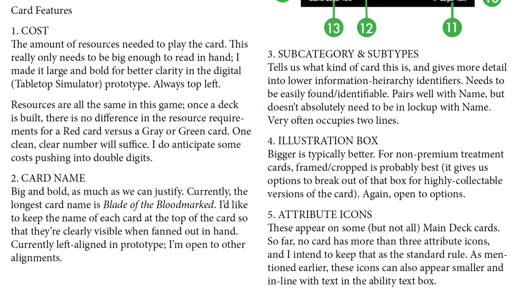
Give your best guess as to the maximum requirements for various information fields (and then maybe add ten percent). From my own graphic design days, nothing sucks more than making a great layout and getting things dialed in to the millimeter just to find later that when the text gets imported, your max allowance for a title cuts off 20% of your card names.
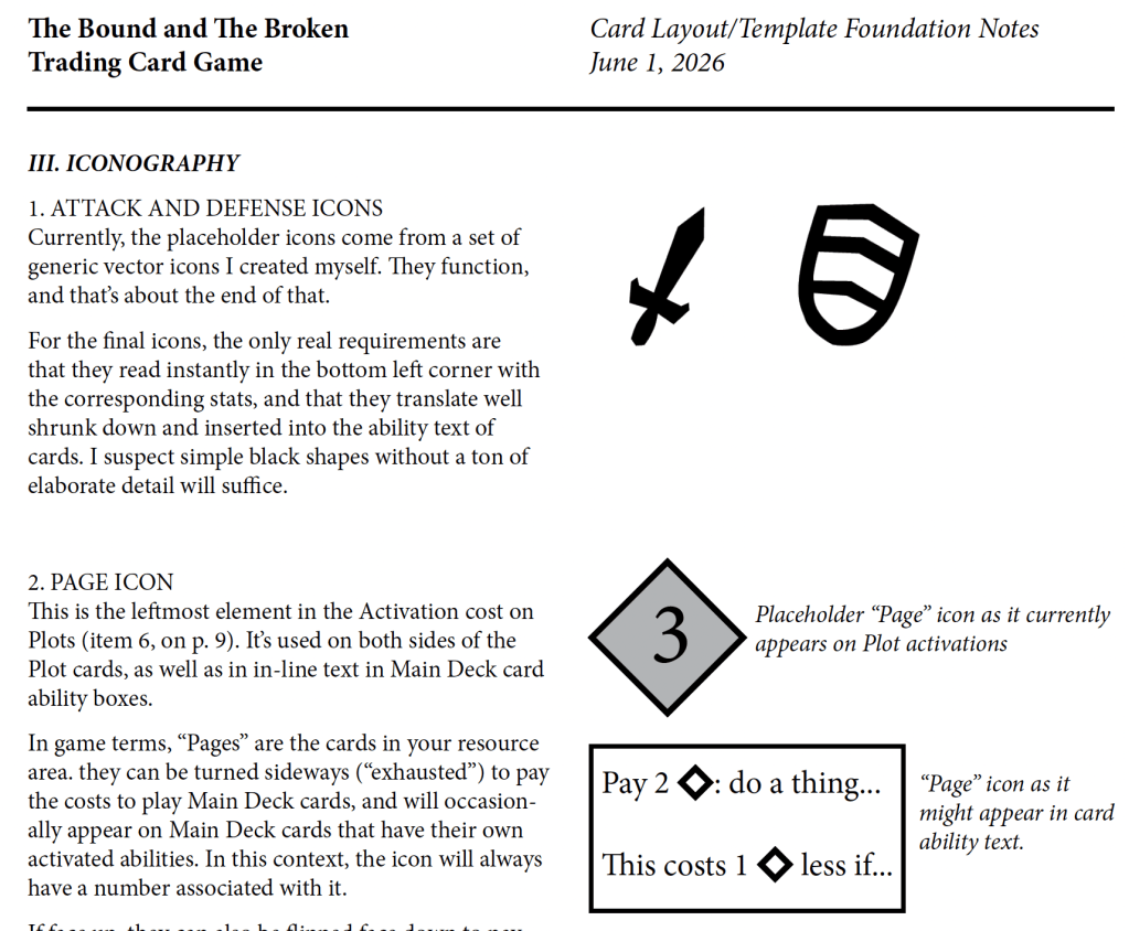
After a bunch of pages covering how to lay out the different card types, I plugged in a few more that talk specifically about iconography on the cards. The graphic designer working on the project has already leaned into some stylistic elements on the art cards, and we expect they’ll be the one to create the visual language components that help us reduce text and convey ideas instantly. I’ve got my own placeholder iconography in there right now, but we want the graphic designer to have the freedom to make them all look really unique and cool. They still need some parameters to work within. That guidance needs to be covered in the document.
The last piece in my notes is an appendix covering some of the design philosophy of the game itself. I wrote last month about the value of a color pie structure in game design. For the design document, I included a brief explanation and “road map” of the color pie for this game. I won’t post that particular page here (there are still some things we’d like to save for when the game demos become more public), but I can’t understate its importance even for graphic design purposes. For any new style element the graphic designer creates, from frames and typography choices to that cool custom iconography mentioned above, the color pie philosophy is going to be helpful to them. Best to give them the tour.
I wouldn’t call the process of writing the card layout document “exhausting”, but I do think it’s fair to describe the finished product as “nearly exhaustive”. I fully expect that there will be more questions after it’s officially handed off, and I’m prepared to converse directly with graphic designer to help them dial in on the pieces they want more background for. I’m very grateful for my time and experience in that world; it’ll help me dial in with them faster, and gives me the confidence that I wasn’t completely throwing darts in the dark when I put together the prototype and guide.
I can’t wait to see what they come up with.

Leave a comment