


Early prototypes usually look pretty bland. It’s way too soon to go commissioning artwork, and that costs money. Even if you did decide to go that way, the game content you’d be illustrating for is likely to change anyway.
Still, having some sort of imagery on your prototype can help identify differences between otherwise similar components at a glance.
Before I was a game designer, I was a graphic designer and art director. It shouldn’t surprise anyone then that I feel strongly about making sure visual elements don’t skew the mechanical testing process, for better or worse. A well-designed prototype has just enough thought put into the visual presentation to make the parts distinct and intuitive; bad visual design can only make the use of those components more cumbersome, and that’s something that will always skew your testers’ experience.
I created a bunch of quick icons to go on several of the cards to help tell them apart at a glance from across the table. Here are some of them. See how many you can figure out without me giving you anything else to go on. (Frankly, if any of them give you considerable trouble, I haven’t done a great job with them.)
In no particular order…
Dodge, Sword, Rapier, Dagger, Staff, Magic, Hammer, Skill, Stealth, Bless, and Bow
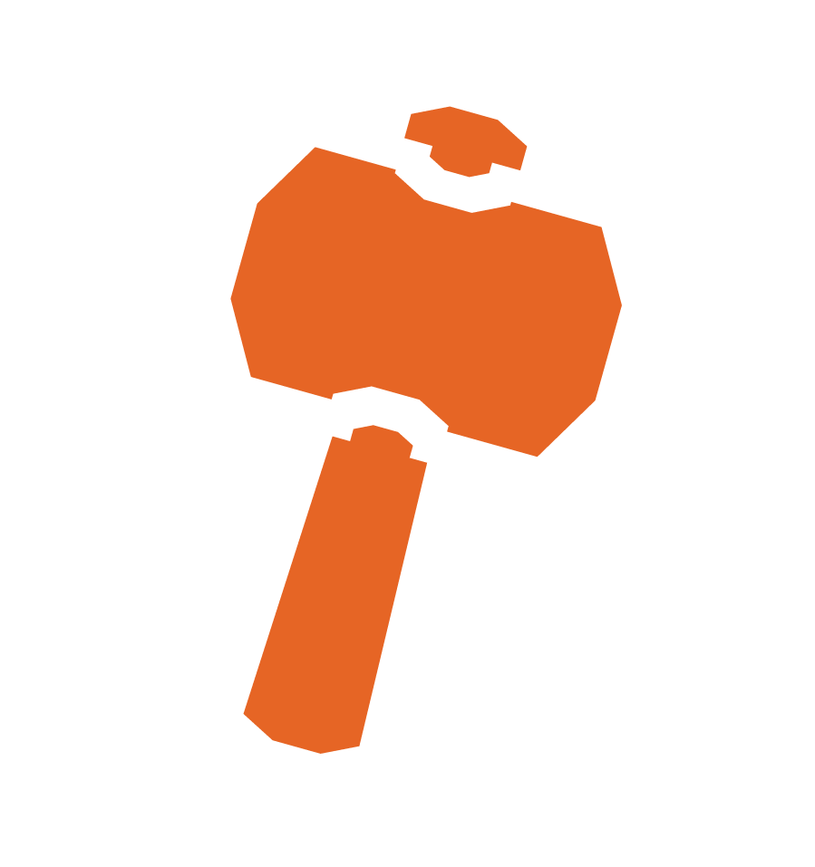






There’s no answer key for this one.
It’s too easy.
I hope.
PREVIOUS:
Playtest At the Disco

Leave a reply to Nancy Fletcher Cancel reply